NB: Content Creator is in legacy mode and all it's features are now covered the same or better by Item Placement Tool. Content Creator will be maintained but will not provide new features in the future.
Using the content creator function type, you are able to add additional content (items) to windows (buttons, labels text-fields, folders and so on). You might know the Item Placement Tool, which does some of the same features, but this can do much more advanced editing.
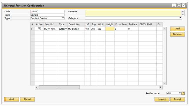
The configuration consists on a matrix, where each row is a new item and each column is a property for the item. There are many properties (25+), but not all are used for each item type.
Property |
Description |
|||||||||||||||||||||||||||||||||
|---|---|---|---|---|---|---|---|---|---|---|---|---|---|---|---|---|---|---|---|---|---|---|---|---|---|---|---|---|---|---|---|---|---|---|
Active |
Controls if this row is active for use. Uncheck this if you temporarily wants to disable an item. |
|||||||||||||||||||||||||||||||||
ItemUid (Mandatory) |
In order to place an item on a window, it must have a unique id for the form. In order to avoid conflict with other add-ons, this should have prefix (e.g. UF_xxx). If a Uid is not unique, an error will occur. NB: A UID SHOULD CONSIST OF LETTERS (ABC), NUMBERS (123) OR/AND UNDERSCORES (_). CHARACTERS LIKE SPACE, DASHES OR SPECIAL CHARACTERS ARE TECHNICALLY POSSIBLE BUT NOT RECOMMENDED AS THESE ARE NOT SUPPORTED BY THE $[$<ITEM>.<COL>.<TYPE>] SYNTAX. WARNING: IF YOU USE THE CONTENT CREATOR TO PLACE DATA ONTO OTHER B1UP WINDOWS IT IS HIGHLY RECOMMENDED THAT YOU USE THE PREFIX "BOYX_" FOR UID AS THIS IS A SPECIAL PREFIX B1UP UNDERSTAND SO IT CAN CONFLICTS DURING UPGRADES. EXAMPLE IF YOU WISH TO ADD A BUTTON ONTO THE RECURRING INVOICE WINDOW CALL IT "BOYX_01 " AS THE UID. |
|||||||||||||||||||||||||||||||||
Type (Mandatory) |
With the content creator it is possible to create the following item types:
|
|||||||||||||||||||||||||||||||||
Description |
Here you can set a description of the item normally shown in the lower left corner of the client. In types Button, Label and Checkbox this is the caption of the item. |
|||||||||||||||||||||||||||||||||
Left |
This indicate the left position of the item in pixels |
|||||||||||||||||||||||||||||||||
Top |
This indicate the top position of the item in pixels |
|||||||||||||||||||||||||||||||||
Width |
Here you can set the width of the item. If nothing is entered, the default width is used NB: ITEM TYPES: RECTANGLE, TEXT AREA AND PICTURE SHOULD ALWAYS HAVE A WIDTH |
|||||||||||||||||||||||||||||||||
Height |
Here you can set the height of the item. If nothing is entered, the default height is used. NB: ITEM TYPES: RECTANGLE, TEXT AREA AND PICTURE SHOULD ALWAYS HAVE A HEIGHT |
|||||||||||||||||||||||||||||||||
Form Pane / To Pane |
Pane level is the information about which folder (tab-page) the item is on. All items of a folder will have the same Pane level. Items that are shown all the time have Pane level 0. Online Guide: Understanding Pane levels |
|||||||||||||||||||||||||||||||||
DBDS: Field |
This property is used if the item should be bound (related) to a user defined field of the current window. A user defined field always starts with ”U_” and can be seen using the system information NB: ONLY USED IN CHECKBOX, COMBO BOX, TEXT AREA AND PICTURE ITEM TYPES (NOT MANDATORY) |
|||||||||||||||||||||||||||||||||
DBDS: Table |
This is the second part of the data-binding, where you enter the name of the table that the user defined field is bound to. As an example, if your field is linked to a business partner, the table is OCRD while if it is linked to items it is OITM. NB: ONLY USED IN CHECKBOX, COMBO BOX, TEXT AREA AND PICTURE ITEM TYPES (NOT MANDATORY) |
|||||||||||||||||||||||||||||||||
Edit: Add |
This checkbox gives you the option to indicate if your item is editable in the window’s add-mode (e.g. If your button can be pressed in add-mode). |
|||||||||||||||||||||||||||||||||
Edit: Find |
This checkbox gives you the option to indicate if your item is editable in the window’s find-mode. |
|||||||||||||||||||||||||||||||||
Edit: Ok |
This checkbox gives you the option to indicate if your item is editable in the window’s OK-mode. |
|||||||||||||||||||||||||||||||||
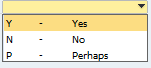
Valid Values |
Here you can set a collection of valid values a combo box item type should contain. The syntax is as follows: VALUE,DESCRIPTION;VALUE,DESCRIPTION… Sample: Y,Yes;N,No;P,Perhaps The above would give 3 options in a combo box.
Alternative you can type SQL:<SQL-sentence>. In order for it to work with this you need to produce an SQL with two columns .. If you do not have at least two you will get an error. If you give it more it will ignore exceeding columns. Sample: SQL:SELECT Code, Name FROM [@MY_TABLE] WHERE U_ACTIVE = 'Y' Tip: to include an empty value do it like this: Sample: SQL:SELECT '', '' UNION ALL SELECT Code, Name FROM [@MY_TABLE] WHERE U_ACTIVE = ‘Y’ NB: ONLY USED IN COMBO BOX ITEM TYPES (NOT MANDATORY) |
|||||||||||||||||||||||||||||||||
Affects Form mode |
Use this option if you want an item that does not affect the form mode (e.g. If unchecked and a window is in ok-mode, it will not cause a switch to update mode) |
|||||||||||||||||||||||||||||||||
Right Justified |
Use this option to set if data in an edit text field are right-justified or not.
NB: ONLY USED IN EDIT TEXT ITEM TYPES AND TEXT AREA ITEM TYPES |
|||||||||||||||||||||||||||||||||
Suppress Zeroes |
Use this option to get edit text fields to show nothing if the value is zero NB: ONLY USED IN EDIT TEXT ITEM TYPES AND TEXT AREA ITEM TYPES |
|||||||||||||||||||||||||||||||||
Text Style |
Use this option to set the text-style of the item (Bold, Italic, Underline, and so on) |
|||||||||||||||||||||||||||||||||
Fore Color |
Use this option to set the text-color of the item (RGB value in long representation) TIP: RIGHT-CLICK THE COLUMN TO PICK THE COLOR |
|||||||||||||||||||||||||||||||||
Back Color |
Use this option to set the background-color of the item (RGB value in long representation) TIP: RIGHT-CLICK THE COLUMN TO PICK THE COLOR NB: NOT ALL GUI ELEMENTS CAN APPLY COLOR. THE FOLLOWING LIST SHOW WHAT CAN BE COLORED AND WHAT CANNOT
|
|||||||||||||||||||||||||||||||||
Font-size |
Here you can set the font-size of the item. If nothing is entered, the default will be used. |
|||||||||||||||||||||||||||||||||
Linked Object |
This property is used with linked buttons and decides what the link-button should point to when pressed. NB: ONLY USED WITH THE LINKED BUTTON ITEM TYPE (MANDATORY) |
|||||||||||||||||||||||||||||||||
Link To |
Link to is primary used to tell a linked button where the data to link to is stored (an edit texts Uid), but Link to is also used to link labels and other items together (the little with line under the label link to another item) and to group items together on resizable windows. NB: MANDATORY FOR LINKED BUTTON ITEM TYPE. OPTIONAL FOR OTHER TYPES |
|||||||||||||||||||||||||||||||||
Group With |
Group with is used to link a new Folder (tab) item to an existing folder-collection. Just provide the new Folder with the Uid of one of the existing folders. TIP: THE LEFT-PROPERTY OF THE FOLDER ITEM CONTROLS WHERE IN THE COLLECTION YOUR TAB IS PLACED NB: ONLY USED WITH THE FOLDER (TAB) ITEM TYPE (MANDATORY) |
|||||||||||||||||||||||||||||||||
Val Off / Val On |
With Val Off/Val On, you can override what data-value of a checkbox is considered as the checked and what is for unchecked. If not set the default valOn/off is used (Val On = Y, Val Off = N). NB: ONLY USED WITH THE CHECKBOX ITEM TYPE (NOT MANDATORY) |

On header level you have the following options that affect all lines:
Field |
Description |
||||||
|---|---|---|---|---|---|---|---|
Render Mode |
This option determines how the B1UP should apply the configuration to the window affected.
|