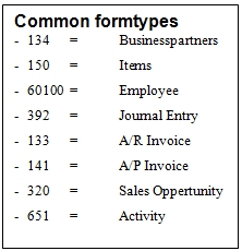
Active
|
Use the checkbox to enable or disable the line. Often used while debugging
|
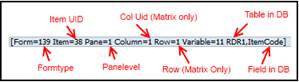
ItemUid
|
The unique identifiers of the user defined item that you to work with. The item UID can be found in the debug information when pointing the mouse at the item.
NB: A UID SHOULD CONSIST OF LETTERS (ABC), NUMBERS (123) OR/AND UNDERSCORES (_). CHARACTERS LIKE SPACE, DASHES OR SPECIAL CHARACTERS ARE TECHNICALLY POSSIBLE BUT NOT RECOMMENDED AS THESE ARE NOT SUPPORTED BY THE $[$<ITEM>.<COL>.<TYPE>] SYNTAX.
NB: BECAUSE OF THE LIMITATION ON HOW LONG A ITEM UID CAN BE AND THE CHANGE TO LET UDF-UIDS UP TO 18 CHARACTERS FROM VERSION 2005 AND FORWARD, YOU WILL NEED TO PROVIDE YOUR OWN UNIQUE ID IF YOU HAVE A FIELD THAT ARE OVER 8 CHARS (10 IF YOU COUNT THE “U_”), AND PLACE THE FIELD NAME IN THE “FIELD COLUMN”
|
Description
|
The description of the item UID specified. This description is used as label if you link one to the item (See label column).
|
Table
|
The table of the Item. The table can be seen using the debug information when pointing the mouse over the item.
|
Field
|
If you have UDFs with a name of over 8 chars, you will need to use this field to enter the name. Remember the “U_”
|
Placement type
|
• Pixel Placement – Items are placed using Left / Top pixels
• Relative Placement (above, below, left, right) – Items are placed in relation to an item
If Pixel Placement is selected Left/Top should be filled.
If Relative Placement is selected (above, below, left, right) “Placement item” and “Placement spacing” should be filled.
|
Placement item
|
The item that should be used as the relative item when doing relative placement. This field is required if relative placement is selected.
|
Placement spacing
|
This field defines the space between the placement item and them item if relative placement is selected.
|
Type
|
Choose which type the item should be:
Type
|
Description
|
Edit Text (Default)
|
A normal field
NB: USER DEFINED FIELDS THAT HAVE VALID VALUES CANNOT BE SHOWN AS EDIT TEXTS
|
Text area
|
Used for larger texts with multiple lines. Should be linked to a user defined field of type Alpha Text
NB: USER DEFINED FIELDS THAT HAVE VALID VALUES CANNOT BE SHOWN AS TEXT AREAS
|
Combo box
|
Dropdown list with valid values to choose from. Should be linked to a user defined field with valid values
TIP: IF YOU WISH TO CREATE YOUR OWN SET OF VALID VALUES IT IS NOT POSSIBLE WITH ITEM PLACEMENT TOOL BUT IT IS POSSIBLE WITH UNIVERSAL FUNCTION – CONTENT CREATOR
WARNING: If your Combobox is linked to a User Defined Table, That table needs to be visible in Tools > User-Defined Windows in order to work
|
Checkbox
|
An item that can have the state checked (Y) or unchecked (N). Should be linked to a user defined field of Alpha Regular (Length: 1, Default value ‘Y’ or ‘N’)
|
Picture
|
An item that is shown as a picture. Should be linked to a picture UDF
|
Static Text
|
An item there shows a stand-alone label
|
Button
|
An item there shows a Button.
NB TO MAKE THE BUTTON WORK USE B1VALIDATION SYSTEM
|
Rectangle
|
An item there shows a rectangle. Width and Height is used to decide the size of the rectangle
|
Golden Arrow
|
Makes a stand-alone golden arrow.
To make the golden arrow work together with a field you need to set the link to columns value to the field there contains the value the arrow uses.
|
Tab
|
Makes a standalone tab. Requires that the field group with is filled
NB: WE RECOMMEND YOU USE THE CUSTOM TAB SYSTEM TO CREATE TABS
|
ComboButton
|
An item there shows a ComboButton.
NB TO MAKE THE BUTTON WORK USE B1VALIDATION SYSTEM
|
|
Left
|
Indicate the left value in pixels from the left border and left.
|
Top
|
Indicate the top value in pixels from the window’s title bar and down.
|
Width
|
Here you can enter the new width of the item in pixels. You can also leave it blank keep original width.
|
Height
|
Here you can enter the new height of the item in pixels. You can also leave it blank keep original height.
|
From Pane / To Pane
|
Pane level is the information about which folder (tab-page) the item are on. All items of a folder will have the same Pane level. Items that are shown all the time have Pane level 0.
Tip: Learn more about panelevels here
|
Label
|
Indicate that the item should have a label tied to it. If checked the description are used as caption for the label.
|
Label Width
|
Gives you the option to specify a width of the label if you find it too long or too short.
NB: This field is not used then you do relative placement. Instead the width is calculated from the above linked field
|
Link To
|
Linkto allows you to tell the link to link to another item on the window and thereby inherit that items placement properties
NB: WHEN PLACING A STANDALONE GOLDEN ARROW THIS SHOULD BE THE FIELD THERE CONTAIN THE VALUE THERE IS USED WHEN THE ARROW IS PRESSED.
FOR MORE INFORMATION ABOUT THIS PLEASE SEE: GUIDE – THE LIMITATIONS IN SCREEN LAYOUT USING ITEM PLACEMENT TOOL
Online tip: How to use Link To system
|
Golden Arrow
|
Here you can choose if you want a golden arrow next to the UDF. You can choose one of the pre-defined values or choose Custom (and let B1 Validation define what the Golden arrow does)
NB: You can also open Beas windows if you have the Beas add-on installed
Sample video1 | Sample video 2 (Custom action)
|
Choose from List
|
Here you can choose if you want a Choose from list on the UDF. The choose from list will only be shown if the field has the right type in the database.
Example: A UDF with a sales order Choose from list will only be shown if the UDF is a numeric field.
If you choose a CFL type that isn’t compatible with the UDF field a warning will be shown. 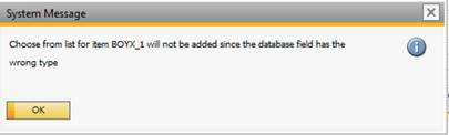
NB: IF YOU MAKE A CHOOSE FROM LIST IT WILL ALWAYS RETURN THE PRIMARY KEY (EXAMPLE ON A SALES ORDER IT WILL STORE THE DOCENTRY IN YOUR UDF BUT DISPLAY THE DOCNUM)
It’s also possible to have a choose from list that is linked to an UDO if the UDF is linked to a UDO. An UDF with a choose from list set to an UDO will only be shown if the UDF is Linked to an UDO.
|
Condition
|
Here you can define a condition for the choose from list chosen.
To define the condition click on the cell in the row you want to define the condition for. This will another window where you can setup your condition.
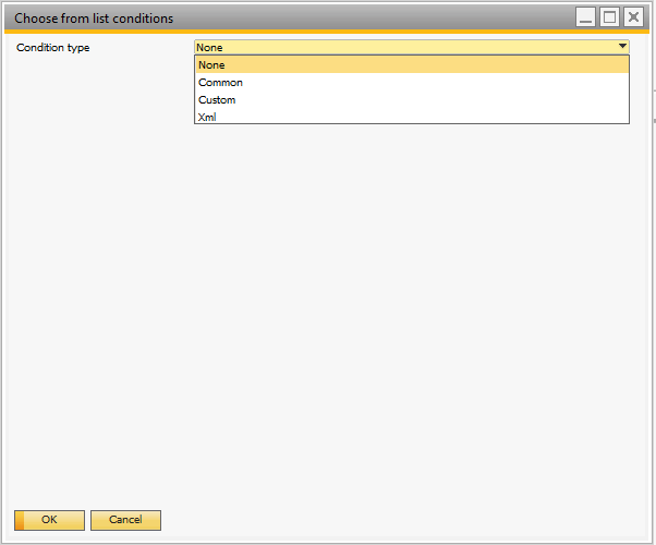
you can define a condition in the different ways.
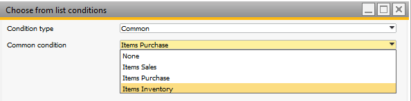
if you choose a common condition, you get the option to choose from list of predefined conditions there will work with the chosen choose from list.
Custom Condition:
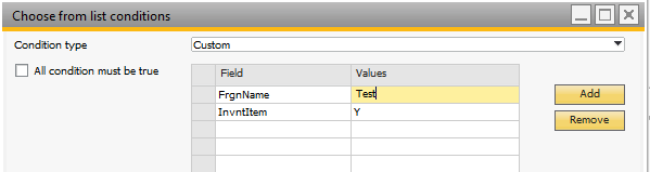
Here you can make you own condition by telling which value different fields should have to be include in the choose from list. you can also if all of the condition should be meet or only one of them
NB: Custom condition can only be used to make equal conditions
NB: A field does only support one value
Xml Condition
it possible to write your own Choose from list condition using XML
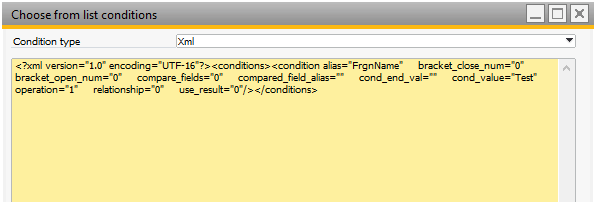
Example: If you wish on Users to exclude the Deleted Users you can use the following XML to exclude:
<?xml version="1.0" encoding="UTF-16"?><conditions> <condition alias="GROUPS" bracket_close_num="0" bracket_open_num="0" compare_fields="0" compared_field_alias="" cond_end_val="" cond_value="99" operation="6" relationship="0" use_result="0"/></conditions>
|
Edit: Add
|
This checkbox allows you to determine how the UDF line item behaves in Add-mode. If checked you can edit the data, if unchecked the data is disabled
|
Edit: OK
|
This checkbox allows you to determine how the UDF line item behaves in OK-mode. If checked you can edit the data, if unchecked the data is disabled
|
Edit: Find
|
This checkbox allows you to determine how the UDF line item behaves in Find-mode. If checked you can edit the data, if unchecked the data is disabled
|
Password
|
This option allows you to see the data of an edit text as a password (Data shown as stars). NB: Other types ignore this option.
|
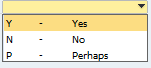
Valid Values
|
Here you can set a collection of valid values a combo box or combo button item type should contain. The syntax is as follows: VALUE,DESCRIPTION;VALUE,DESCRIPTION…
Sample: Y,Yes;N,No;P,Perhaps
The above would give 3 options in a combo box.
Alternative you can type SQL:<SQL-sentence>. In order for it to work with this you need to produce an SQL with two columns. If you do not have at least two you will get an error. If you give it more it will ignore exceeding columns.
Sample: SQL:SELECT Code, Name FROM [@MY_TABLE] WHERE U_ACTIVE = 'Y'
Sample video
Tip: If you wish to make your valid values dynamically based on other fields on the the screen please note that you CAN'T use dynamic syntax in this field. Instead please see this video on how to make them dynamic
|
Affect Formmode
|
Use this option if you want an item that does not affect the form mode (e.g. If unchecked and a window is in ok-mode, it will not cause a switch to update mode)
|
Right Justified
|
Use this option to set if data in an edit text field are right-justified or not.
 - Not right justified - Not right justified
 - Right Justified: - Right Justified:
NB: ONLY USED IN EDIT TEXT ITEM TYPES AND TEXT AREA ITEM TYPES
|
Suppress Zeroes
|
Use this option to get edit text fields to show nothing if the value is zero
NB: ONLY USED IN EDIT TEXT ITEM TYPES AND TEXT AREA ITEM TYPES
|
Text Style
|
Use this option to set the text-style of the item (Bold, Italic, Underline, and so on)
|
Fore Color
|
Use this option to set the text-color of the item (RGB value in long representation)
TIP: RIGHT-CLICK THE COLUMN TO PICK THE COLOR
|
Back Color
|
Use this option to set the background-color of the item (RGB value in long representation)
TIP: RIGHT-CLICK THE COLUMN TO PICK THE COLOR
NB: NOT ALL GUI ELEMENTS CAN APPLY COLOR. THE FOLLOWING LIST SHOW WHAT CAN BE COLORED AND WHAT CANNOT
GUI Item type
|
Fore color
|
Back color
|
Button
|
No
|
No
|
Combo button
|
No
|
No
|
Checkbox
|
(Yes) [Only Code render mode due to SDK bug]
|
No
|
Combo box
|
Yes
|
Yes
|
Edit Text
|
Yes
|
Yes
|
Folder (Tab)
|
No
|
No
|
Label
|
Yes
|
Yes
|
Linked Button (Golden arrow)
|
No
|
No
|
Picture
|
No
|
No
|
Rectangle
|
No
|
No
|
Text area
|
No
|
No
|
|
Font Size
|
Here you can set the font-size of the item. If nothing is entered, the default will be used.
|
Picture Path
|
If you line is of type Picture and you just want a fixed picture shown (aka not bound to a user-defined field) you can specify the path to the picture here and leave the Table and Field columns empty. This is handy if you as an example would like a small information icon next to a field that if pressed run a report (using B1 Validation System and UF -SQL Report)
|
Val On/Val Off
|
With Val Off/Val On, you can override what data-value of a checkbox is considered as the checked and what is for unchecked. If not set the default valOn/off is used (Val On = Y, Val Off = N).
NB: ONLY USED WITH THE CHECKBOX ITEM TYPE (NOT MANDATORY)
|
Category
|
The lines category (See configuration categories)
|
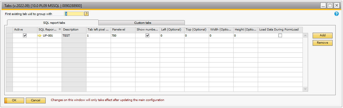
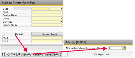
Group with
|
The id of the first tab on the system form. Is needed to create a tab.
|
Golden Arrow Object Type
|
Is used when creating stand-alone golden arrow to indicate what the golden arrow should do when pressed.
|
Tab item: Same Height as
|
This field is used internally when a tab is created using the Tab wizard and should not be used for anything else.
|
Tab item: Same Height as
|
This field is used internally when a tab is created using the Tab wizard and should not be used for anything else.
|